
ColorMunki Screen Calibration Experience
I used the ColorMunki for a couple of months on both my old Windows HP laptop as well as my brand-new MacBook Pro. I was tempted to calibrate an LCD monitor on my desktop, but the ColorMunki is limited to use on three computers and I wanted to keep one in reserve.
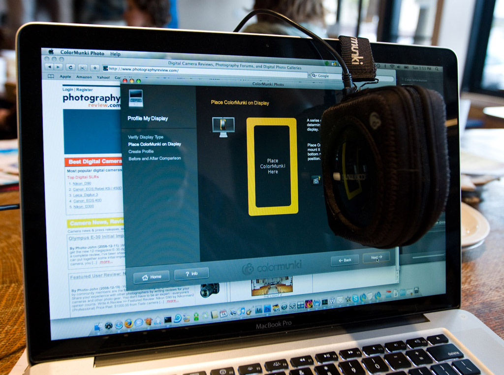
Calibrating your screen is straight-forward with the “easy” mode: you place the ColorMunki on your screen, watch colors flash, and compare the before-and-after results. The total time was about a minute and a half on my MacBook Pro. The advanced mode gives you slightly more control. You can set your white point and adjust the contrast and brightness of your monitor if it has those controls. You can also adjust your display’s luminance based on the ColorMunki’s ambient light measurement.
Using the ColorMunki requires that you manage the four dial positions, the pouch, the counterweight on the pouch, and the shutter on the pouch. There is an awkward dance as you make sure it’s in the pouch, turn the dial to the instrument calibration position, press the button, hang it from your screen, turn the dial to the spot measurement position, and press the button again. If you want to use the ambient light measurement, you have to take the ColorMunki out of the pouch and put it back in. While the software helps guide you through this dance, I would frequently get tripped up by accidentally pressing the button while turning the dial, losing track of the pouch, or forgetting to open the shutter on the pouch.
On multiple uses the ColorMunki proved to be very precise. It initially judged the display on my MacBook Pro to be too bright and warm. It offers to remind you to calibrate every one to four weeks, so I tried calibrating again after two weeks and found that it produced the same result. I also tested it in different settings — even my local coffee shop — and produced identical results. I’ve been happy with the results and the consistency has given me confidence.
When you’re one of the first to use a brand new product you can expect some rough edges and the ColorMunki has a few. To get started with the ColorMunki, you will likely have to download a hefty, 250MB update. At the time of this review, even the latest update (1.0.5) has room for improvement. It took me a couple of minutes to get started. There is a large ColorMunki icon on the OS X Dock that I tried clicking on first. After a bit of fruitless exploration, I discovered that this icon is completely useless — there’s a separate ColorMunki icon on the OS X Menu Bar that you’re supposed to click on instead. Mac OS X users will also notice that there are three ColorMunki icons on the OS X Dock and another on the Menu Bar, which is a lot for one product.
A bigger annoyance was that the software isn’t smart about the MacBook Pro’s design. I expected more from software that uses a MacBook as its laptop icon. You’re instructed to use controls like contrast that don’t exist and it tells you to place the ColorMunki in the center of the screen. Placing it there covers the MacBook Pro’s light sensor, which changes the brightness. There is an easy solution: place the ColorMunki to the side.
next page – ColorMunki Printer Calibration Experience >>
Leave a Reply